Recently, some collaborators from the PAGE study had a list of a few hundred SNPs gathered from multiple loci across the genome. For analysis purposes, they were interested in quantifying the number of loci these SNPs represented – in other words, how many distinct signals were represented by their collection of SNPs.
We had linkage disequilibrium data from the HapMap for all pairs of SNPs, and we filtered this using an r-squared cutoff. What we were left with was a mess of SNP pairs that could be tedious to sort through in a spreadsheet. Instead, I represented each pair of SNPs as an edge in a network and loaded the data into Gephi, which provides some wonderful analysis tools. Suppose my LD data is structured like this:
| SNP1 | SNP2 | d-prime | r-squared |
| 16969968 | 1051730 | 0.98 | 1 |
| 2036534 | 1051730 | 0.92 | 0.205 |
| 578776 | 1051730 | 0.96 | 0.23 |
| 8034191 | 1051730 | 1 | 0.961 |
| 8042374 | 1051730 | 0.99 | 0.205 |
| ... | ... | ... | ... |
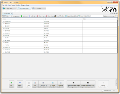
In a spreadsheet application, I sorted and filtered the LD pairings I wanted using either the r-squared or the d-prime columns. I then deleted any rows that didn’t meet my cutoff, renamed the header for SNP1 to “Source” and SNP2 to “Target”, and exported the file as a comma-separated file (.csv). I opened Gephi, clicked the “Data Laboratory” tab, and Import Spreadsheet to load my data.

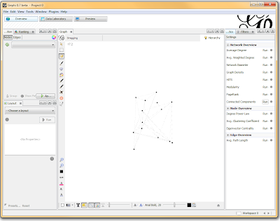
Once loaded, I clicked on the “Overview” tab and I can see my graph. The graph looks like a big mess, but we don’t really care how it looks – we’re going to run an analysis. In the “statistics” tab on the right-hand side, you’ll see an option for “connected components”. This runs an algorithm that picks apart and labels collections of nodes that are connected. Running this only takes a second.

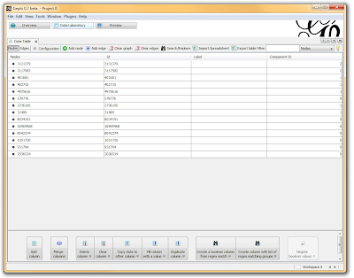
I then click on the “Data Laboratory” tab again, and I can see that my nodes are labeled with an ID. This corresponds to the Locus those SNPs represent.

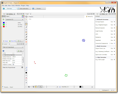
If you want to actually SEE how these relationships fall out, we’ll need to run a layout engine. Back on the “Overview” tab, on the lower left-hand side, there is a drop-down allowing you to choose a layout engine. I have found YifanHu’s Multilevel to be the quickest and most effective for separating small groups like these. Depending on the size of your graph, it may take a moment to run. Once its finished, you should be able to see the components clearly separated. If you want, you can color code them by clicking the green “refresh” button in the “partition” tab in the upper left corner. This reloads the drop-down menu and will provide you with an option to color the nodes by component ID. Select this, and click apply to see the results!

I’ve used Gephi component analysis to do all kinds of fun things, like the number of families in a study using pairwise IBD estimates, looking at patterns of phenotype sharing in pedigrees, and even visualizing citation networks. Sometimes representing a problem as a graph lets you find patterns more easily than examining tables of numbers.
Hi,
ReplyDeletewould like to explore genetic similarities between different cattle breeds using bovine 50K SNP genotype frequencies. I’m fascinated by networks approach, but have little experience in using Gephi tool. I oaded my data into Gephi with 73 nodes and 2056 edges, it displayed a graph looks like complex and very mess. Can some one help me how to get nice separation between the components. I am willing to provide my data.
Thanks,
Ali A.
Hi Ali, If you are looking to examine genetic differences based on genotypes, I'd recommend using Principal Component Analysis. I am in the process of writing up a post on this subject.
ReplyDeleteThat said, the network approach may be useful also. I'm curious -- how are you defining the edges? If they are weighted by a value, there may be a way to use that information to get better separation.