Here are citations for the articles discussed at our most recent meeting (July 17). Our next meeting is scheduled for July 31.
~Julia
Bianconi G, Pin P, Marsili M. Assessing the relevance of node features for network structure. Proc Natl Acad Sci U S A, 2009 Jul 14; 106(28):11433-8.
Briggs AW, Good JM, Green RE, Krause J, Maricic T, Stenzel U, Lalueza-Fox C, Rudan P, Brajkovic D, Kucan Z, Gusic I, Schmitz R, Doronichev VB, Golovanova LV, de la Rasilla M, Fortea J, Rosas A, Pääbo S. Targeted retrieval and analysis of five Neandertal mtDNA genomes. Science, 2009 Jul 17; 325(5938):318-21.
Cagliani R, Fumagalli M, Pozzoli U, Riva S, Comi GP, Torri F, Macciardi F, Bresolin N, Sironi M. Diverse evolutionary histories for beta-adrenoreceptor genes in humans. Am J Hum Genet, 2009 Jul; 85(1):64-75.
Elbers CC, van Eijk KR, Franke L, Mulder F, van der Schouw YT, Wijmenga C, Onland-Moret NC. Using genome-wide pathway analysis to unravel the etiology of complex diseases. Genet Epidemiol, 2009 Jul; 33(5):419-31.
Greenway SC, et al. De novo copy number variants identify new genes and loci in isolated sporadic tetralogy of Fallot. Nat Genet. 2009 Jul 13. [Epub ahead of print]
Hastings PJ, Lupski JR, Rosenberg SM, Ira G. Mechanisms of change in gene copy number. Nat Rev Genet, 2009 Aug; 10(8):551-64.
Holmans P, Green EK, Pahwa JS, Ferreira MA, Purcell SM, Sklar P; Wellcome Trust Case-Control Consortium, Owen MJ, O'Donovan MC, Craddock N. Gene ontology analysis of GWA study data sets provides insights into the biology of bipolar disorder. Am J Hum Genet, 2009 Jul; 85(1):13-24.
Huttenhower C, Haley EM, Hibbs MA, Dumeaux V, Barrett DR, Coller HA, Troyanskaya OG. Exploring the human genome with functional maps. Genome Res, 2009 Jun; 19(6):1093-106.
The International Schizophrenia Consortium. Common polygenic variation contributes to risk of schizophrenia and bipolar disorder. Nature, 2009 Jul 1. [Epub ahead of print]
Johannes F, Porcher E, Teixeira FK, Saliba-Colombani V, Simon M, Agier N, Bulski A, Albuisson J, Heredia F, Audigier P, Bouchez D, Dillmann C, Guerche P, Hospital F, Colot V. Assessing the impact of transgenerational epigenetic variation on complex traits. PLoS Genet, 2009 Jun; 5(6):e1000530.
Mendell JT. Tumors line up for a letdown. Nat Genet, 2009 Jul; 41(7):768-9.
Murphy A, Tantisira KG, Soto-Quirós ME, Avila L, Klanderman BJ, Lake S, Weiss ST, Celedón JC. PRKCA: a positional candidate gene for body mass index and asthma. Am J Hum Genet, 2009 Jul; 85(1):87-96.
Newcombe PJ, Verzilli C, Casas JP, Hingorani AD, Smeeth L, Whittaker JC. Multilocus Bayesian meta-analysis of gene-disease associations. Am J Hum Genet, 2009 May; 84(5):567-80.
Nicodemus KK, Malley JD. Predictor correlation impacts machine learning algorithms: implications for genomic studies. Bioinformatics, 2009 Aug 1; 25(15):1884-90.
Song M, Nicolae DL. Restricted parameter space models for testing gene-gene interaction. Genet Epidemiol, 2009 Jul; 33(5):386-93.
Spencer CC, Su Z, Donnelly P, Marchini J. Designing genome-wide association studies: sample size, power, imputation, and the choice of genotyping chip. PLoS Genet, 2009 May; 5(5):e1000477.
Vansteelandt S, Goetgeluk S, Lutz S, Waldman I, Lyon H, Schadt EE, Weiss ST, Lange C. On the adjustment for covariates in genetic association analysis: a novel, simple principle to infer direct causal effects. Genet Epidemiol, 2009 Jul; 33(5):394-405.
Monday, July 27, 2009
R Snippet for Sampling from a Dataframe
It took me a while to figure this out, so I thought I'd share.
I have a dataframe with millions of observations in it, and I want to estimate a density distribution, which is a memory intensive process. Running my kde2d function on the full dataframe throws and error -- R tries to allocate a vector that is gigabytes in size. A reasonable alternative is to run the function on a smaller subset of the data. R has a nifty sample function, but it is designed to randomly sample from a vector, not a 2D dataframe. The sample function CAN work for this though, like so:
Now, sub contains a subset from my 2D dataframe containing 100000 observations. This example was a sample without replacement, but if you set replace=TRUE, you can get a sample with replacement also.
I have a dataframe with millions of observations in it, and I want to estimate a density distribution, which is a memory intensive process. Running my kde2d function on the full dataframe throws and error -- R tries to allocate a vector that is gigabytes in size. A reasonable alternative is to run the function on a smaller subset of the data. R has a nifty sample function, but it is designed to randomly sample from a vector, not a 2D dataframe. The sample function CAN work for this though, like so:
sub <- Dataset[sample(1:dim(Dataset)[1], size=100000, replace=FALSE),]
Now, sub contains a subset from my 2D dataframe containing 100000 observations. This example was a sample without replacement, but if you set replace=TRUE, you can get a sample with replacement also.
Tags:
R
A Primer on Logistic Regression (using Stata)
This handy introduction comes from UCLA's Statistical Computing webbook on logistic regression. If you're familiar with linear regression but you've never used logistic regression before, this is a good place to start. In addition to laying down some basic terminology and theory, this tutorial shows you how to access their example dataset, and gives you the Stata commands they use so you can follow along through their examples.
Introduction to Logistic Regression with Stata
If you're not sure when to use logistic regression, check out the two previous posts on choosing the right analysis for your data: part I and part II.
Introduction to Logistic Regression with Stata
If you're not sure when to use logistic regression, check out the two previous posts on choosing the right analysis for your data: part I and part II.
Tags:
Stata,
Statistics,
Tutorials
Wednesday, July 22, 2009
Advanced QQ Plots in R
***Update Monday, November 09, 2009: The sma package is no longer available on CRAN. See this updated post for making QQ-plots in R using ggplot2.***
Nearly everyone who has read a paper on a genome-wide association study should now be familiar with the QQ-plot. "QQ" stands for Quantile-Quantile plot -- the point of these figures is to compare two probability distributions to see how well they match or where differences occur. In the GWAS context, these plots are often drawn to compare the distribution of observed p-values to the expected distribution under the null hypothesis of no association. The null hypothesis in this case would generate a uniform distribution -- a flat histogram over all statistical tests with a total density of 1.
It is fantastically easy to generate beautiful QQ plots for all kinds of distributions in STATA. The commands are qnorm (to compare your data to a normal distribution), qchi (to compare to a chi-square distribution), and qqplot (to compare two variables within your own data).
To make a QQ plot to a uniform distribution, you'll have to make that distribution yourself, but its quite easy. First, make a new index variable like so
This will number all of your observations from 1 to N. Next, generate the uniform from this index like so
This takes each index from the dataset and divides it by the total N number of observations (_N is an internal STATA variable for the number of obs). The theory here is that under the null, p-values will be evenly distributed across all observations. Also, a popular option is to take the -log10 of the observed p-value and the uniform. This alters the interpretation of the data point to indicate the order of magnitude of the p-value.
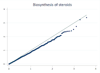
While STATA makes this easy, its also rather simple to do this in R, and there are few features that make R more flexible. I'll walk you through this example:
First, I load a handy library called "sma" that makes it simple to draw the line through our QQ plot. Next, I read my p-values from a text file into a data frame. For this example, I took the -Log10 of the values. I used the seq function to generate the index for my observations, and then divided that value by the total number of observations to generate the uniform distribution. I then take the -Log10 of this also. Then we draw the QQplot of the observed p-values versus the uniform, and the last line adds the qqline. Fairly similar to the STATA procedure.
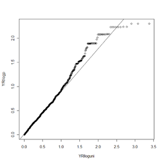
Now for the fun. R gives us much more control over the graphics we display than STATA does. We can change tons of plot options and even add additional data to the same plot. In this example, I had ran the same analysis on two datasets, CEU and YRI. With R, I can make a QQ plot that shows both of these distributions compared to the uniform. Here's the code:
To do this requires a couple of tricks. First, we draw the YRI plot just as above. Then we load and process the CEU data the same way we did the YRI. In this case we aren't using the qqplot function to display the CEU data, however, so we need to mimic some of its functions on our own. The first trick is to SORT both the uniform distribution values and the observed p-values. Next, we draw the YRI qqplot, just as above. We then use the par function to tell R we want to draw on top of the existing plot (new=TRUE). I can't explain the symantics as to why new=TRUE accomplishes this, but it does. Next, we will plot our CEU data with the plot command. Since they are both sorted, this mimics the QQ plot function (which simply sorts them internally). For this example, I changed the alpha value on the color for the two data points so they are slightly transparent. Not only does it make it pretty, it lets you see when two points overlap.
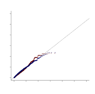
In this example, I turned off several plot features, like the title and the axis labels. One other word of caution -- when combining plots like this make sure that you have the SAME uniform distribution under the null hypothesis, otherwise you aren't making a fair comparison!
Nearly everyone who has read a paper on a genome-wide association study should now be familiar with the QQ-plot. "QQ" stands for Quantile-Quantile plot -- the point of these figures is to compare two probability distributions to see how well they match or where differences occur. In the GWAS context, these plots are often drawn to compare the distribution of observed p-values to the expected distribution under the null hypothesis of no association. The null hypothesis in this case would generate a uniform distribution -- a flat histogram over all statistical tests with a total density of 1.
It is fantastically easy to generate beautiful QQ plots for all kinds of distributions in STATA. The commands are qnorm (to compare your data to a normal distribution), qchi (to compare to a chi-square distribution), and qqplot (to compare two variables within your own data).
To make a QQ plot to a uniform distribution, you'll have to make that distribution yourself, but its quite easy. First, make a new index variable like so
egen index = fill( 1 2 3 )
This will number all of your observations from 1 to N. Next, generate the uniform from this index like so
gen uniform = index / _N
This takes each index from the dataset and divides it by the total N number of observations (_N is an internal STATA variable for the number of obs). The theory here is that under the null, p-values will be evenly distributed across all observations. Also, a popular option is to take the -log10 of the observed p-value and the uniform. This alters the interpretation of the data point to indicate the order of magnitude of the p-value.

While STATA makes this easy, its also rather simple to do this in R, and there are few features that make R more flexible. I'll walk you through this example:
library(sma)
YRI <- read.delim("X:/YRI-903.tdt.hap.qq", header=FALSE) YRIlogp = -log10(YRI$V1) YRIindex <- seq(1, nrow(YRI)) YRIuni <- YRIindex/nrow(YRI) YRIloguni <- -log10(YRIuni) qqplot(YRIloguni, YRIlogp) plot.qqline(YRIloguni, YRIlogp)
First, I load a handy library called "sma" that makes it simple to draw the line through our QQ plot. Next, I read my p-values from a text file into a data frame. For this example, I took the -Log10 of the values. I used the seq function to generate the index for my observations, and then divided that value by the total number of observations to generate the uniform distribution. I then take the -Log10 of this also. Then we draw the QQplot of the observed p-values versus the uniform, and the last line adds the qqline. Fairly similar to the STATA procedure.

Now for the fun. R gives us much more control over the graphics we display than STATA does. We can change tons of plot options and even add additional data to the same plot. In this example, I had ran the same analysis on two datasets, CEU and YRI. With R, I can make a QQ plot that shows both of these distributions compared to the uniform. Here's the code:
YRI <- read.delim("X:/YRI-903.tdt.hap.qq", header=FALSE) YRIlogp = -log10(YRI$V1) YRIindex <- seq(1, nrow(YRI)) YRIuni <- YRIindex/nrow(YRI) YRIloguni <- -log10(YRIuni) CEU <- read.delim("X:/CEU-903.tdt.hap.qq", header=FALSE) CEUlogp = -log10(CEU$V1) CEUlogp = sort(CEUlogp) CEUindex <- seq(1, nrow(CEU)) CEUuni <- CEUindex/nrow(CEU) CEUloguni <- -log10(CEUuni) CEUloguni <- sort(CEUloguni) qqplot(YRIloguni, YRIlogp, xlim=range(0,6), ylim=range(0,6), col=rgb(100,0,0,50,maxColorValue=255), pch=19, lwd=2, bty="l",xlab ="", ylab ="") plot.qqline(YRIloguni, YRIlogp, a=0.25, lty="dashed") par(new=TRUE, cex.main=4.8, col.axis="white") plot(CEUloguni, CEUlogp, xlim=range(0,6), ylim=range(0,6), col=rgb(0,0,100,50,maxColorValue=255), pch=19, lwd=2, bty="l",xlab ="", ylab ="")
To do this requires a couple of tricks. First, we draw the YRI plot just as above. Then we load and process the CEU data the same way we did the YRI. In this case we aren't using the qqplot function to display the CEU data, however, so we need to mimic some of its functions on our own. The first trick is to SORT both the uniform distribution values and the observed p-values. Next, we draw the YRI qqplot, just as above. We then use the par function to tell R we want to draw on top of the existing plot (new=TRUE). I can't explain the symantics as to why new=TRUE accomplishes this, but it does. Next, we will plot our CEU data with the plot command. Since they are both sorted, this mimics the QQ plot function (which simply sorts them internally). For this example, I changed the alpha value on the color for the two data points so they are slightly transparent. Not only does it make it pretty, it lets you see when two points overlap.

In this example, I turned off several plot features, like the title and the axis labels. One other word of caution -- when combining plots like this make sure that you have the SAME uniform distribution under the null hypothesis, otherwise you aren't making a fair comparison!
Tags:
GWAS,
Visualization
Monday, July 20, 2009
ggplot2: more wicked-cool plots in R
As far as I know there are 3 different systems for producing figures in R: (1) base graphics, included with R, (2) the lattice package, and (3) ggplot2, one of the newer plotting systems which is, according to the creator Hadley Wickham, "based on the grammar of graphics, which tries to take the good parts of base and lattice graphics and none of the bad parts. It takes care of many of the fiddly details that make plotting a hassle (like drawing legends) as well as providing a powerful model of graphics that makes it easy to produce complex multi-layered graphics."
ggplot2 works much differently than the the base graphics package you might be used to, so here's where to go for some documentation:
A blog called Learning R has put together a 6-part (and counting) series of posts dedicated to taking the book on the lattice package and recreating all the examples using ggplot2. Look at these to get an idea of the stylish Tufte-friendly graphics ggplot2 can create.
Part 1
Part 2
Part 3
Part 4
Part 5
Part 6
Next, Springer is publishing a book on ggplot2 next week, but until it's published, you can download the entire PDF for free along with example code at the ggplot2 website. So hurry up and download it - publication is set for July 28!
Tags:
ggplot2,
R,
Recommended Reading,
Visualization
Monday, July 13, 2009
23andMe Research Revolution
Still, it's worth keeping an eye on the new "democratizing research" approach that 23andMe is taking. Current 23andMe customers are invited to participate in any of these research projects, and their enrollment counts as a "vote" towards starting a research project on that particular phenotype. They're also offering a basic version of their personal genome services for $99 for new customers interested in participating. Daniel MacArthur at Genetic Future wrote an interesting piece on 23andMe's latest venture - an article definitely worth reading, and the comments also. In it he suggests that
...academics need to take heed of the model the company is pursuing. It's likely that over the next few years the current model for returning research data to participants - i.e. don't - will become increasingly unpopular with potential research subjects, and indeed I'd argue that this model has always bordered on the unethical. Finding realistic ways of presenting large-scale genetic data to research participants is something that academic researchers will need to sort out soon, one way or another - and those that do it well, I suspect, will find it much easier to recruit and maintain their research cohorts.
Keep an eye out here for more news on the personal genomics scene.
Tags:
News
Thursday, July 9, 2009
Obama names Francis Collins NIH Director
In his statement, Obama noted: "The National Institutes of Health stands as a model when it comes to science and research. My administration is committed to promoting scientific integrity and pioneering scientific research and I am confident that Dr. Francis Collins will lead the NIH to achieve these goals. Dr. Collins is one of the top scientists in the world, and his groundbreaking work has changed the very ways we consider our health and examine disease. I look forward to working with him in the months and years ahead."
Tags:
News
Tuesday, July 7, 2009
The genetics of quantitative traits: challenges and prospects
Nice review on the genetics of quantitative traits with good figures and references published this morning in Nature Reviews Genetics.
Abstract:
The genetics of quantitative traits: challenges and prospects (NRG AOP)
Abstract:
A major challenge in current biology is to understand the genetic basis of variation for quantitative traits. We review the principles of quantitative trait locus mapping and summarize insights about the genetic architecture of quantitative traits that have been obtained over the past decades. We are currently in the midst of a genomic revolution, which enables us to incorporate genetic variation in transcript abundance and other intermediate molecular phenotypes into a quantitative trait locus mapping framework. This systems genetics approach enables us to understand the biology inside the 'black box' that lies between genotype and phenotype in terms of causal networks of interacting genes.
The genetics of quantitative traits: challenges and prospects (NRG AOP)
Tags:
Recommended Reading
Thursday, July 2, 2009
Getting help with R
There's no doubt that by now you've noticed that we're big fans of R around here. It's completely free, has superior graphing capabilities, and with all the extension packages available there isn't much it can't do. One of the problems with R especially to new users is that it isn't obvious how to find help when you need it, so I'll try to provide a few resources here.
If you're completely new to R but you know some statistics, I've mentioned this book once before - Introductory Statistics with R by Peter Daalgard ($48, Amazon). I was able to get a good feel for using R after only a few hours with this book. For some free help to get started, check out my previous post covering Theresa Scott's R course, which provides links to her website and her course materials. One reader commented that Theresa's tutorials were better than any R book he'd ever read.
If you've used R before but need a quick reference on the arguments for a particular command, just type a "?" followed by the name of the command: ?rnorm.
What's a little more difficult is figuring out how to do something in R where you don't know the commands or packages that will do it. One option is a Google search, but "R" is not a very helpful search term, and you'll often find irrelevant results. To deal with that, some R users have developed a custom Google search at Rseek.org, which will perform a Google search for your terms but only return results from sites known to contain R help and documentation.
Finally, check out the previously mentioned R clinic at Vanderbilt. Ever week Theresa Scott in biostatistics holds a clinic and allows R users to bring in specific questions and/or their own data for help.
Subscribe to:
Comments (Atom)