Thursday, September 29, 2011

The Utility of Network Analysis

Like most bioinformatics nerds (or anyone with a facebook account), I’m fascinated by networks. Most people immediately think of protein-protein interaction networks, or biological pathways when thinking about networks, but sometimes representing a problem as a network makes solving problems easier.

Recently, some collaborators from the PAGE study had a list of a few hundred SNPs gathered from multiple loci across the genome. For analysis purposes, they were interested in quantifying the number of loci these SNPs represented – in other words, how many distinct signals were represented by their collection of SNPs.

We had linkage disequilibrium data from the HapMap for all pairs of SNPs, and we filtered this using an r-squared cutoff. What we were left with was a mess of SNP pairs that could be tedious to sort through in a spreadsheet. Instead, I represented each pair of SNPs as an edge in a network and loaded the data into Gephi, which provides some wonderful analysis tools. Suppose my LD data is structured like this:


SNP1SNP2d-primer-squared
1696996810517300.981
203653410517300.920.205
57877610517300.960.23
8034191105173010.961
804237410517300.990.205
............


In a spreadsheet application, I sorted and filtered the LD pairings I wanted using either the r-squared or the d-prime columns. I then deleted any rows that didn’t meet my cutoff, renamed the header for SNP1 to “Source” and SNP2 to “Target”, and exported the file as a comma-separated file (.csv). I opened Gephi, clicked the “Data Laboratory” tab, and Import Spreadsheet to load my data.


Once loaded, I clicked on the “Overview” tab and I can see my graph. The graph looks like a big mess, but we don’t really care how it looks – we’re going to run an analysis. In the “statistics” tab on the right-hand side, you’ll see an option for “connected components”. This runs an algorithm that picks apart and labels collections of nodes that are connected. Running this only takes a second.


I then click on the “Data Laboratory” tab again, and I can see that my nodes are labeled with an ID. This corresponds to the Locus those SNPs represent.


If you want to actually SEE how these relationships fall out, we’ll need to run a layout engine. Back on the “Overview” tab, on the lower left-hand side, there is a drop-down allowing you to choose a layout engine. I have found YifanHu’s Multilevel to be the quickest and most effective for separating small groups like these. Depending on the size of your graph, it may take a moment to run. Once its finished, you should be able to see the components clearly separated. If you want, you can color code them by clicking the green “refresh” button in the “partition” tab in the upper left corner. This reloads the drop-down menu and will provide you with an option to color the nodes by component ID. Select this, and click apply to see the results!
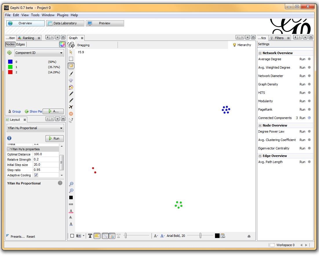


I’ve used Gephi component analysis to do all kinds of fun things, like the number of families in a study using pairwise IBD estimates, looking at patterns of phenotype sharing in pedigrees, and even visualizing citation networks. Sometimes representing a problem as a graph lets you find patterns more easily than examining tables of numbers.

Thursday, September 8, 2011

I'm Starting a New Position at the University of Virginia

I just accepted an offer for a faculty position at the University of Virginia in the Center for Public Health Genomics / Department of Public Health Sciences. Starting in October I will be developing and directing a new centralized bioinformatics core in the UVA School of Medicine. Over the next few weeks I'm taking a much-needed vacation next door in Kauai and then packing up for the move to Charlottesville. Posts here may be sparse over the next few weeks, but once I start my new gig I'll be sure to make up for it. And if you're bioinformatics-savvy and in the job market keep an eye out here - once I figure out what I need I will soon be hiring, and will repost any job announcements here.

I've enjoyed my postdoc here at the University of Hawaii Cancer Center, and there is much I'll miss about island life out here in the Pacific. But I'm very seriously looking forward to getting started in this wonderful opportunity at UVA. Thank you all for your comments, suggestions, and help when I needed it. I'll be back online in a few weeks - until then, follow me on Twitter (@genetics_blog).

Aloha!

True Hypotheses are True, False Hypotheses are False

I just read Gregory Cooper and Jay Shendure's review "Needles in stacks of needles: finding disease-causal variants in a wealth of genomic data" in Nature Reviews Genetics. It's a good review about how to narrow down deleterious disease-causing variants from many, many variants throughout the genome when statistics and genetic information alone isn't enough.

I really liked how they framed the multiple-testing problem that routinely plagues large-scale genetic studies, where nominal significance thresholds can yield many false positives when applied to multiple hypothesis tests:

However, true hypotheses are true, and false hypotheses are false, regardless of how many are tested. As such, the actual 'multiple testing burden' depends on the proportion of true and false hypotheses in any given set: that is, the 'prior probability' that any given hypothesis is true, rather than the number of tests per se. This challenge can thus be viewed as a 'naive hypothesis testing' problem — that is, when in reality only one or a few variants are causal for a given phenotype, but all (or many) variants are a priori equally likely candidates, the prior probability of any given variant being causal is miniscule. As a consequence, extremely convincing data are required to support causality, which is potentially unachievable for some true positives.

Defining the challenge in terms of hypothesis quality rather than quantity, however, points to a solution. Specifically, experimental or computational approaches that provide assessments of variant function can be used to better estimate the prior probability that any given variant is phenotypically important, and these approaches thereby boost discovery power.

Check out the full review at Nature Reviews Genetics:

Needles in stacks of needles: finding disease-causal variants in a wealth of genomic data

Wednesday, September 7, 2011

Excel Template for Mapping Four 96-Well Plates to One 384-Well Plate

Daniel Cook in Jeff Murray's lab at the University of Iowa put together this handy Excel template for keeping track of how samples from four 96-well plates are interleaved to configure a single 384-well plate using robotic liquid handling systems, like the Hydra II.

Paste in lists of samples on your 96-well plates:


And you'll get out a map of how the 384-well plate layout:


And a summary list:


You can download the Excel file here. Thanks for sharing, Daniel.

Wednesday, August 31, 2011

Personal Genomics and Data Sharing Survey

I was recently contacted by a couple of German biologists working on a project evaluating opinions on sharing raw data from DTC genetic testing companies like 23andme. A handful of people like the gang at Genomes Unzipped, the PGP-10, and others at SNPedia have released their own genotype or sequencing data into the public domain. As of now, data like this is scattered around the web and most of it is not attached to any phenotype data.

These three biologists are working on a website that collects genetic data as well as phenotypic data. The hope is to make it easy to find and access appropriate data and to become a resource for a kind of open-source GWAS - similar to the research 23andMe performs in its walled garden right now.

But because of privacy concerns, many people (myself included) hesitate to freely publish their genetic data for the world to see. These three biologists are conducting a survey to assess how willing people might be to participate in something like this, and for what reasons they would (or would not). The survey can be accessed at http://bit.ly/genotyping_survey. It took about 2 minutes for me to complete, and you can optionally sign up to receive an email with their results once they've completed the survey.

Although I'm still hesitant to participate in something like this myself, I like the idea, and I'm very interested to see the results of their survey. Hit the link below if you'd like to take the quick survey.

Personal Genomics and Data Sharing Survey

Monday, August 29, 2011

Bioinformatics Posters Collection

I mentioned BioStar in a previous post about getting all your questions answered. I can't emphasize enough how helpful the BioStar and other StackExchange communities are. Whenever I ask a statistics question on CrossValidated or a programming question on StackOverflow I often multiple answers within 10 minutes.

Recently there was a question on BioStar from someone making their poster for a bioinformatics poster presentation and wanted some inspiration for design and layout. No less than 7 community members posted responses the same day, linking to sites where you can download poster presentations, including VIZBI 2011 (workshop on visualizing biological data), F1000 Posters (which collects posters from the Intelligent Systems for Molecular Biology conference), Nature Precedings (not specifically limited to bioinformatics), and several others.

While you can see plenty of posters at the meeting you're attending, it isn't much help when you're trying to design and layout your poster beforehand. I've used the same tired old template for poster presentations for years, and it's helpful to see examples of other bioinformatics posters for fresh ideas about design and layout.

I would also encourage you to deposit some of your posters in places like F1000 (deposit link) or Nature Precedings (submission link). While these aren't peer-reviewed, it can really increase the visibility of your work, and it gives you a permanent DOI (at least for Nature Precedings) that you can link to or reference in other scientific communication.

See this Q&A at BioStar for more.

Monday, August 22, 2011

Estimating Trait Heritability from GWAS Data

Peter Visscher and colleagues have recently published a flurry of papers employing a new software package called GCTA to estimate the heritability of traits using GWAS data (GCTA stands for Genome-wide Complex Trait Analysis -- clever acronymity!). The tool, supported (and presumably coded) by Jian Yang is remarkably easy to use, based in part on the familiar PLINK commandline interface. The GCTA Homepage provides an excellent walk-through of the available options.

The basic idea is to use GWAS data to estimate the degree of "genetic sharing" or relatedness among the samples, computing what the authors call a genetic relationship matrix (GRM). The degree of genetic sharing among samples is then related to the amount of phenotypic sharing using restricted maximum likelihood analysis (REML). The result is an estimate of the variance explained by the SNPs used to generate the GRM. Full details of the stats along with all the gory matrix notation can be found in their software publication.

The approach has been applied to several disorders studied by the WTCCC and to a recent study of human height. Interestingly, the developers have also used the approach to partition the trait variance across chromosomes, resulting in something similar to population-based variance-components linkage analysis. The approach works for both quantitative and dichotomous traits, however the authors warn that variance estimates of dichotomous trait liability are influenced by genotyping artifacts.

The package also includes several other handy features, including a relatively easy way to estimate principal components for population structure correction, a GWAS simulation tool, and a regression-based LD mapping tool. Download and play -- a binary is available for Linux, MacOS, and DOS/Windows.

Monday, August 15, 2011

Sync Your Rprofile Across Multiple R Installations

Your Rprofile is a script that R executes every time you launch an R session. You can use it to automatically load packages, set your working directory, set options, define useful functions, and set up database connections, and run any other code you want every time you start R.

If you're using R in Linux, it's a hidden file in your home directory called ~/.Rprofile, and if you're on Windows, it's usually in the program files directory: C:\Program Files\R\R-2.12.2\library\base\R\Rprofile. I sync my Rprofile across several machines and operating systems by creating a separate script called called syncprofile.R and storing this in my Dropbox. Then, on each machine, I edit the real Rprofile to source the syncprofile.R script that resides in my Dropbox.

One of the disadvantages of doing this, however, is that all the functions you define and variables you create are sourced into the global environment (.GlobalEnv). This can clutter your workspace, and if you want to start clean using rm(list=ls(all=TRUE)), you'll have to re-source your syncprofile.R script every time.

It's easy to get around this problem. Rather than simply appending source(/path/to/dropbox/syncprofile.R) to the end of your actual Rprofile, first create a new environment, source that script into that new environment, and attach that new environment. So you'll add this to the end of your real Rprofile on each machine/installation:

my.env <- new.env()
sys.source("C:/Users/st/Dropbox/R/Rprofile.r", my.env)
attach(my.env)

All the functions and variables you've defined are now available but they no longer clutter up the global environment.

If you have code that you only want to run on specific machines, you can still put that into each installation's Rprofile rather than the syncprofile.R script that you sync using Dropbox. Here's what my syncprofile.R script looks like - feel free to take whatever looks useful to you.

Creative Commons License
Getting Genetics Done by Stephen Turner is licensed under a Creative Commons Attribution-NonCommercial 3.0 Unported License.