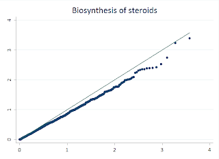
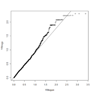
Nearly everyone who has read a paper on a genome-wide association study should now be familiar with the QQ-plot. "QQ" stands for Quantile-Quantile plot -- the point of these figures is to compare two probability distributions to see how well they match or where differences occur. In the GWAS context, these plots are often drawn to compare the distribution of observed p-values to the expected distribution under the null hypothesis of no association. The null hypothesis in this case would generate a uniform distribution -- a flat histogram over all statistical tests with a total density of 1.
It is fantastically easy to generate beautiful QQ plots for all kinds of distributions in STATA. The commands are qnorm (to compare your data to a normal distribution), qchi (to compare to a chi-square distribution), and qqplot (to compare two variables within your own data).
To make a QQ plot to a uniform distribution, you'll have to make that distribution yourself, but its quite easy. First, make a new index variable like so
egen index = fill( 1 2 3 )
This will number all of your observations from 1 to N. Next, generate the uniform from this index like so
gen uniform = index / _N
This takes each index from the dataset and divides it by the total N number of observations (_N is an internal STATA variable for the number of obs). The theory here is that under the null, p-values will be evenly distributed across all observations. Also, a popular option is to take the -log10 of the observed p-value and the uniform. This alters the interpretation of the data point to indicate the order of magnitude of the p-value.

While STATA makes this easy, its also rather simple to do this in R, and there are few features that make R more flexible. I'll walk you through this example:
library(sma)
YRI <- read.delim("X:/YRI-903.tdt.hap.qq", header=FALSE) YRIlogp = -log10(YRI$V1) YRIindex <- seq(1, nrow(YRI)) YRIuni <- YRIindex/nrow(YRI) YRIloguni <- -log10(YRIuni) qqplot(YRIloguni, YRIlogp) plot.qqline(YRIloguni, YRIlogp)
First, I load a handy library called "sma" that makes it simple to draw the line through our QQ plot. Next, I read my p-values from a text file into a data frame. For this example, I took the -Log10 of the values. I used the seq function to generate the index for my observations, and then divided that value by the total number of observations to generate the uniform distribution. I then take the -Log10 of this also. Then we draw the QQplot of the observed p-values versus the uniform, and the last line adds the qqline. Fairly similar to the STATA procedure.

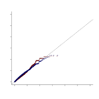
Now for the fun. R gives us much more control over the graphics we display than STATA does. We can change tons of plot options and even add additional data to the same plot. In this example, I had ran the same analysis on two datasets, CEU and YRI. With R, I can make a QQ plot that shows both of these distributions compared to the uniform. Here's the code:
YRI <- read.delim("X:/YRI-903.tdt.hap.qq", header=FALSE) YRIlogp = -log10(YRI$V1) YRIindex <- seq(1, nrow(YRI)) YRIuni <- YRIindex/nrow(YRI) YRIloguni <- -log10(YRIuni) CEU <- read.delim("X:/CEU-903.tdt.hap.qq", header=FALSE) CEUlogp = -log10(CEU$V1) CEUlogp = sort(CEUlogp) CEUindex <- seq(1, nrow(CEU)) CEUuni <- CEUindex/nrow(CEU) CEUloguni <- -log10(CEUuni) CEUloguni <- sort(CEUloguni) qqplot(YRIloguni, YRIlogp, xlim=range(0,6), ylim=range(0,6), col=rgb(100,0,0,50,maxColorValue=255), pch=19, lwd=2, bty="l",xlab ="", ylab ="") plot.qqline(YRIloguni, YRIlogp, a=0.25, lty="dashed") par(new=TRUE, cex.main=4.8, col.axis="white") plot(CEUloguni, CEUlogp, xlim=range(0,6), ylim=range(0,6), col=rgb(0,0,100,50,maxColorValue=255), pch=19, lwd=2, bty="l",xlab ="", ylab ="")
To do this requires a couple of tricks. First, we draw the YRI plot just as above. Then we load and process the CEU data the same way we did the YRI. In this case we aren't using the qqplot function to display the CEU data, however, so we need to mimic some of its functions on our own. The first trick is to SORT both the uniform distribution values and the observed p-values. Next, we draw the YRI qqplot, just as above. We then use the par function to tell R we want to draw on top of the existing plot (new=TRUE). I can't explain the symantics as to why new=TRUE accomplishes this, but it does. Next, we will plot our CEU data with the plot command. Since they are both sorted, this mimics the QQ plot function (which simply sorts them internally). For this example, I changed the alpha value on the color for the two data points so they are slightly transparent. Not only does it make it pretty, it lets you see when two points overlap.

In this example, I turned off several plot features, like the title and the axis labels. One other word of caution -- when combining plots like this make sure that you have the SAME uniform distribution under the null hypothesis, otherwise you aren't making a fair comparison!
Thanks! Very helpful.
ReplyDeleteDear Stephen,
ReplyDeleteIs it possible to create QQ plot for multiple sets of p-values generated by different GWAS models? If it is possible, how should the input file look like? What you showed here is just for one set of p-value.
Thanks in advance.